DrawingML Tables - Cell Properties - Borders and Fill
The borders and fill of a table cell are specified by child elements of the table cell properties element <a:tcPr> element, which is a child of the <a:tc> element. Keep in mind that this is how direct formatting of a table cell is applied. To apply a table cell style to a cell, see DrawingML - Tables - Styles.
Borders
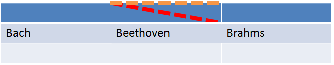
A cell can have borders on the sides, plus two diagonal lines (bottom left to top right and top left to bottom right) for a total of 6 possible borders, each specified by a child element of the table cell properties element. Each border is further customized by a set of attributes and child elements common to all borders. Below is sample table with borders in the second cell of the first row -- an orange dashed top border and a red dashed border top left to bottom right.
The elements for the six possible borders are below.
| Elements | Description |
|---|---|
| lnB | Specifies the bottom border line and its properties. See below for the various attributes and child elements that can further specify the properties of the line. |
| lnBlToTr | Specifies the line running bottom left to top right. See below for the various attributes and child elements that can further specify the properties of the line. |
| lnL | Specifies the left border. See below for the various attributes and child elements that can further specify the properties of the line. |
| lnR | Specifies the right border. See below for the various attributes and child elements that can further specify the properties of the line. |
| lnT | Specifies the top border. See below for the various attributes and child elements that can further specify the properties of the line. |
| lnTlToBr | Specifies the border running top left to bottom right. See below for the various attributes and child elements that can further specify the properties of the line. |
Border Color, Fill and Weight/Thickness
Border Line Type (Dashes, etc.)
- dash
- dashDot
- dot
- lgDash (large dash)
- lgDashDotDot
- sysDash (system dash)
- sysDashDot
- sysDashDotDot
- sysDot
Border lines can also be compound lines. The type of compound line is specified by the cmpd attribute on the line element. E.g., <a:lnT w="76200" cap="flat" cmpd="dbl" algn="ctr">. Possible values are :
- dbl (double)
- sng (single - the default)
- thickThin
- thinThick
- tri (thin thick thin)
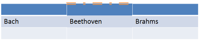
Below is a sample top border with a double line and a preset dash set to dashDot:
Alignment
Line Endings
Line endings can also be specified with the following two child elements of the line element: <a:headEnd> and <a:tailEnd>. Each of these can have attributes that specify the type (type), length (len) and width (w) of the end. The length and width have values of either lg (large), med (medium), or sm (small) and are in relation to the line width. The type can have the following values:
- arrow
- diamond
- none
- oval
- stealth
- triangle
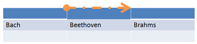
Below is a sample top border with an oval head end and an arrow tail end.
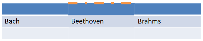
There is also a cap attribute on each of the line elements that can have values of either flat, rnd (a round end) or sq (a square end). So a line with no specified head or tail ending element can still alter the ending by applying one of the cap types. For example, below is a cell with a top border that has round ends: <a:lnT w="76200" cap="rnd" cmpd="sng" algn="ctr">

The joints where lines connect can be customized to specify that the joints should be beveled, mitered, or rounded by specifying either <a:bevel/>, <a:miter/>, or <a:round/> as a child element of the line element. For example, below is a sample of the top and left and right borders that are specified as mitered.