DrawingML Shapes
A gradient fill specifies a smooth, gradual transition from one color to the next color. It is specified with the <a:gradFill> element. In its simplest form, it transitions between two colors. However, it can transition between any number of colors. There are three basic properties to a transition: (1) color, (2) location, and (3) shade style. The colors and locations are defined in a <a:gsLst> or gradient stop list, which defines the transition colors and locations in its child elements. The shade style is defined as a separate child element of <a:gradFill>: either <a:lin/> (linear) or <a:path> (path). Finally, the gradient fill can optionally specify a rectangular region of the shape to which the gradient is applied, with the regioned tiled across the remainder of the shape. This is specified with a <a:tileRect> element.
Elements:
A <a:gradFill> has the following elements.
| Element | Description |
|---|---|
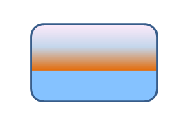
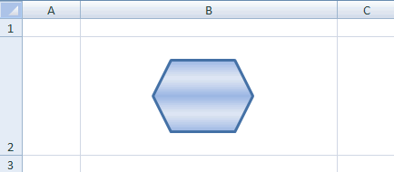
| gsLst | Specifies the gradient stop list, which is a group of <a:gs> or gradient stop elements. These define the gradient colors and relative positions in the color band. Each <a:gs> element contains a child element specifying the color. Colors can be specified using one of the following color options: as a preset color (<a:prstClr>), using hue, saturation and luminance (<a:hslClr>), scheme colors (<a:schemeClr>), system colors (<a:sysClr>), or as RGB percentages or hex numbers (<a:scrgbClr> or <a:srgbClr>). Note that these elements corresponding to color specification methods can also have child elements which transform the base color. So, for example, in the sample below, a scheme or theme color is specified as accent6, but a luminance modulation is applied to that base color. Each <a:gs> element has an attribute pos which specifies where the stop should appear. The value is a percentage corresponding to where along the color band the stop should be. Below is a sample with four gradient stops, one using a theme color and the others specified in RGB values. <a:gradFill>
<a:gsLst>
<a:gs pos="40000">
<a:schemeClr val="accent6">
<a:lumMod val="75000"/>
</a:schemeClr>
</a:gs>
<a:gs pos="39999">
<a:srgbClr val="85C2FF"/>
</a:gs>
<a:gs pos="70000">
<a:srgbClr val="C4D6EB"/>
</a:gs>
<a:gs pos="100000">
<a:srgbClr val="FFEBFA"/>
</a:schemeClr>
</a:gs>
</a:gsLst>
<a:lin ang="16200000" scaled="1"/>
</a:gradFill>
|
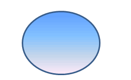
| lin | Specifies a linear gradient. It contains two attributes. First, ang, specifies the direction (clockwise) for the gradient in degrees, ranging from 0 to 360. However, the values are given in 60000ths of a degree. Second scaled specifies whether the angle scales with the fill region. Values are booleans. Below is a sample of a linear gradient at an angle of 90 degrees. <a:lin ang="5400000" scaled="0"/>
|
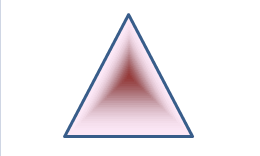
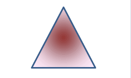
| path | Specifies that a gradient fill should follow a specified path rather than a linear path. It has one attribute path which specifies the path to follow. Possible values are circle, rect, and shape (the gradient should follow the shape). The <a:path> element also contains a child <a:fillToRect> element which defines the focus rectangle for the center shade relative to the fill tile rectangle. The shade will fill the entire tile, except that margins can be specified by attributes. The attributes are b (bottom), l (left), r (right), and t (top); the values are percentages, wtih a positive value indicating an inset and a negative indicating an offset. Below is a sample with a path following the shape. <a:path path="shape">
<a:fillToRect l="50000" t="50000" r="50000" b="0"/>
</a:path>
Below is a sample with a path following a circle.
|
| tileRect | An empty element which specifies a rectangular region of the shape to which the gradient applies. The region is tiled across the remaining area of the shape to complete the fill. The rectangle is specified by percentage offsets from the sides of the shape's bounding box. A positive number specifies an inset (to the right of the bounding box), and a negative number specifies an outset or offset. The offsets on the four sides are specified with the following four attributes whose values are percentages: b (bottom), l (left), r (right), and t (top). Below is a sample with a 75% inset from the bottom: <a:tileRect b="75000"/>.
|
<gradFill> can have the following attributes.
| Attribute | Description |
|---|---|
| flip | Specifies the direction in which to flip the gradient while tiling. This is only relevant when a tileRect is specified so that the gradient must be tiles to fill the shape. Possible values are none, x (horizontal), xy (horizontal and vertical), and y (vertical). |
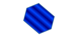
| rotWithShape | Specifies is a fill rotates with the shape when the spape is rotated. Below is a sample with rotation (rotWithShape="1").
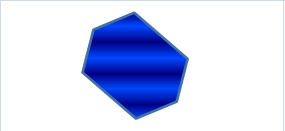
And this is a sample without rotation (rotWithShape="0").
|